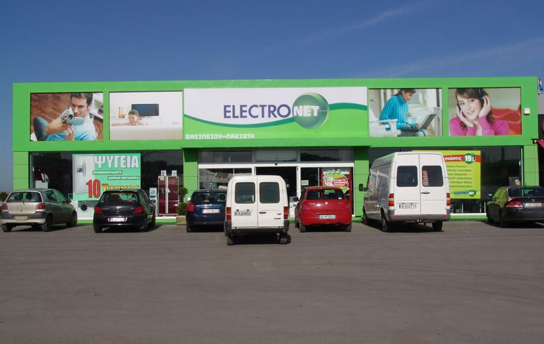
Choosing an illuminated sign for your shopfront
Position, lettering and lighting need to work together. Start with the frontage before deciding on the construction.
Read the guide: Choosing an illuminated sign for your shopfrontA useful sign starts with the business and its surroundings, not simply with an attractive photograph. What should someone passing by be able to read? From which direction and distance? How will the frontage look after dark? These guides help you organise the first decisions before discussing a specific design and construction proposal.
Position, lettering and lighting need to work together. Start with the frontage before deciding on the construction.
Read the guide: Choosing an illuminated sign for your shopfront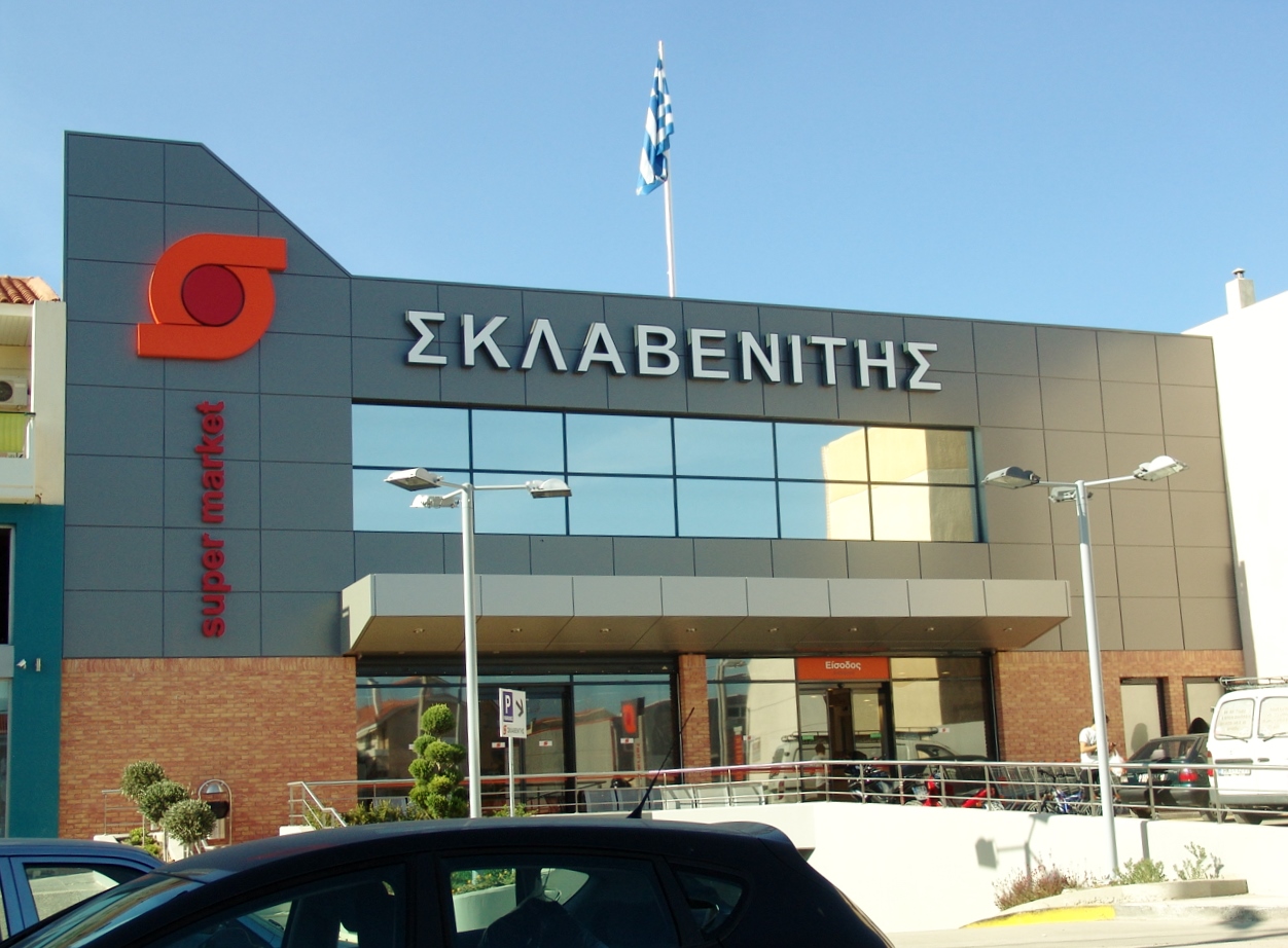
LED describes a lighting technology, not one fixed sign design. Its layout needs to suit the construction and surroundings.
Read the guide: LED sign lighting: the decisions that matter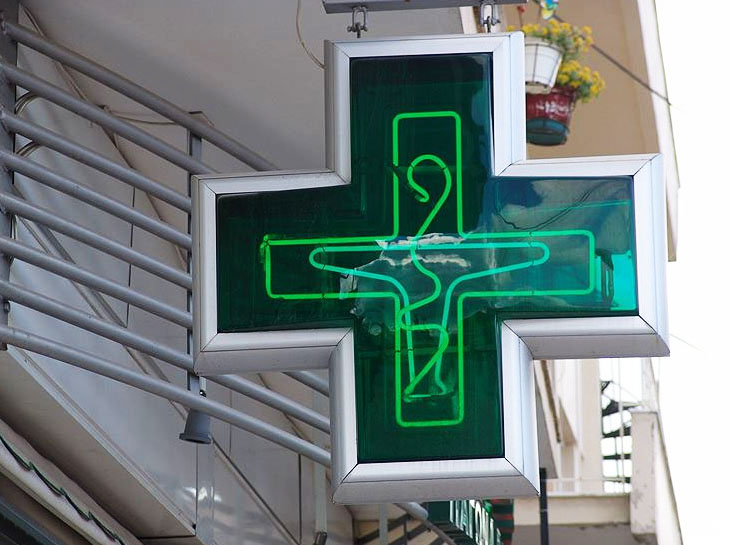
A similar appearance does not mean an identical construction. Clarify the technology, design and setting before choosing.
Read the guide: Neon or LED neon: clarify the sign you are choosing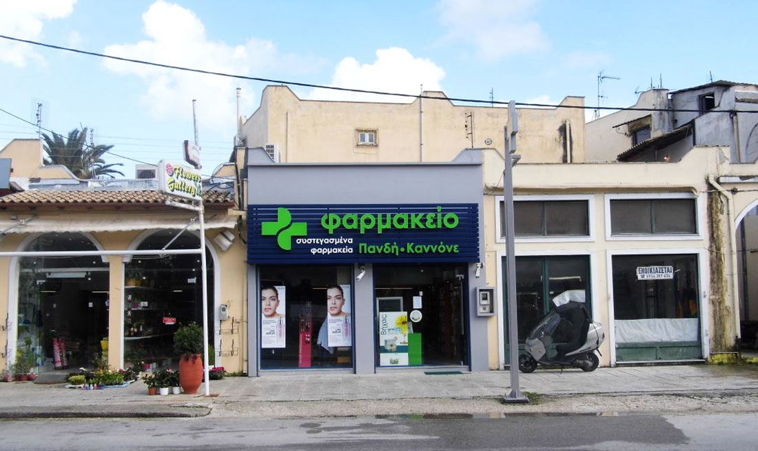
The pharmacy cross, business name and entrance should work as one system. Start with recognition and clear information.
Read the guide: Pharmacy signs: plan the cross and frontage togetherOur first collection covers illuminated signs, LED lighting, neon signs and pharmacy signage. These subjects overlap, but they are not interchangeable. An illuminated sign describes a visible result on a building or inside a space. LED is one of the lighting technologies that may produce that result. Neon has a distinctive visual character that should be considered alongside the identity of the business. Pharmacy signage raises a different set of questions about recognition, clear information and the relationship between the sign and the entrance.
Each guide links to the relevant sign category, where you can explore work shown in the Prisma Art portfolio. Photographs are a starting point for a conversation, not a substitute for assessing your own frontage. Dimensions, materials, colour, available power and fixing positions all contribute to the finished solution. A design suited to a narrow street may need a different approach on a wider road or above a larger shopfront.
Rather than publishing a universal price or promising one construction for every location, we explain the questions worth asking. Consider readable lettering, balanced lighting, access for maintenance and how the new sign works with the rest of the premises. These details make comparisons more meaningful and help a proposal address your actual requirements. Look beyond the immediate visual impression and think about everyday operation as well as appearance.
Bring a recent photograph of the frontage, your logo and approximate measurements. Include the project location, whether the sign will be indoors or outdoors and the hours when it needs to be visible. For a project in Athens, Thebes or another location, confirm the practical conditions of that particular installation rather than assuming that every site is the same. Read the guide most relevant to your business, browse related applications and use our contact page to discuss the next step.
Choose by purpose: start with illuminated signs for frontage visibility, LED for lighting decisions, neon for a distinctive visual style, or pharmacy signage for a pharmacy project.
Yes. It helps explain the effect you like. The final design still needs to suit your logo, dimensions, fixing position and the conditions at your own premises.